During The design process for the re-use of the Pullman Depot, I made a poster to submit for the Sherwin Williams Stir Competition. I drew three perspective drawings, and rendered them in the Sherwin Williams colors I had chosen for the space. This was a fun learning experience because in reality this is what we will be doing. We need to know not only how to combine colors to form a pleasing palette, but we must be able to represent them accurately in our drawings and renderings.
The colors I chose are taken from the artist I used for gallery inspiration. I used the Chip-it tool from Sherwin Williams to accurately match the colors in her artwork to Sherwin Williams paint colors. This builds on the theories of special organization I have been learning all semester. I am also building on the skills of selecting appropriate finishes for furnishings and materials for this setting, and for ADA and Universal Design compliance.
The poster was also a good reason to practice graphic presentation skills. I like the way my poster is coming along and feel more comfortable with the process and outcome each time I do a graphic representation of this kind.
Wednesday, April 16, 2014
Monday, March 24, 2014
Portland Art Museum
Wednesday, March 5, 2014
Vision Impairment
As a designer, it is always a good idea to understand your client. This is especially true if you have a client with special needs for their environment. I experienced being in a wheelchair to understand ADA requirements, and it was very beneficial to my understanding of the needs they have that are different from what I experience. This exercise was to experience what a person with a visual impairment experiences in their interactions with the built environment. I think this is something everyone should try, it really forces you to understand some of the difficulties of visual impairment.
The excercise was to wear sunglasses smeared with Vaseline inside the lenses. We then were to navigate both interior and exterior stairs, use an elevator, and try to use an ATM. I learned that contrast in an interior space is crucial to navigating for someone with a visual impairment, especially from the wall to the floor. I would look to this line to guide me throughout the spaces I was in. Spaces without this contrast were much more difficult. At one point I could not tell there was a room, because the room had glass walls and the carpet and walls were all the same tone. Another problem was glare. Shiny floors with fluorescent lighting made things worse. If I could rely on contrast I was ok, but no contrast and glare to contend with, made navigation very difficult. A third problem was depth perception. This was especially true when trying to navigate stairs. At one point I was trying to go down some terrazzo stairs, and finally had to hold onto the rail, and someone's arm to get down. These stairs had the traditional black grip strips on them, but there was not enough contrast with the color of the stairs to differentiate the contrast.
All in all, it was a good learning experience, one that I will remember when I am designing spaces for the visually impaired.
The excercise was to wear sunglasses smeared with Vaseline inside the lenses. We then were to navigate both interior and exterior stairs, use an elevator, and try to use an ATM. I learned that contrast in an interior space is crucial to navigating for someone with a visual impairment, especially from the wall to the floor. I would look to this line to guide me throughout the spaces I was in. Spaces without this contrast were much more difficult. At one point I could not tell there was a room, because the room had glass walls and the carpet and walls were all the same tone. Another problem was glare. Shiny floors with fluorescent lighting made things worse. If I could rely on contrast I was ok, but no contrast and glare to contend with, made navigation very difficult. A third problem was depth perception. This was especially true when trying to navigate stairs. At one point I was trying to go down some terrazzo stairs, and finally had to hold onto the rail, and someone's arm to get down. These stairs had the traditional black grip strips on them, but there was not enough contrast with the color of the stairs to differentiate the contrast.
All in all, it was a good learning experience, one that I will remember when I am designing spaces for the visually impaired.
Monday, March 3, 2014
Habitat for Humanity Project
This is a poster of a Habitat for Humanity house that I designed with two colleagues. It was a group project, and I learned quite a bit about working with others, and myself. I enjoyed working with the group, and we got along fine. I learned about designing a house for a Habitat family, and the aspects in a home they are looking for. This includes a small foundation footprint , a one car garage, and minimal hallway/extra space. The space is focused on the useable family area, as this is most important in a habitat home. Another thing I learned was to try to design in 2' to 4" increments for the best use of materials. While there are things I would like to improve on, mainly in the poster itself, I am proud of our layout, and the renderings we did for this project.
Concrete Concept
This Design project begins with the adaptive reuse of the Northern Pacific Railway station in Pullman. As my concept inspiration I chose this crack in the concrete foundation of the station. Elements of design that I derived from this include line, from the crack itself, texture from the concrete and the lichens growing on it, and contrast which includes rough and smooth and the differences in the color of the concrete.
The next part of the design process was to take the elements and principles that I found in my concept inspiration and create a 2-dimensional drawing . After exploring many options, I decided to move forward with this design. Now you may think this appears to be a flower, but to me it is a path. It is somewhat random, as the crack, but also somewhat predictable, like a topographical map of a steep slope. The lines represent the obstacles along the way, much like the path of life, or even a path of a railroad track.
From This drawing I progressed to my textile design. I took the line drawing and repeated it in a "path" varying the size and color of the design. The colors are derived from the color of the lichen in the concept inspiration, and the color of the sky, which I always think of when I think of hiking along a path.
Finally, I took my 2-Dimensional design and created a 3-Dimensional model using the same elements and principles of design from the other parts of this project. This concept process of the design was so difficult for me in the beginning, but now it has to be one of my favorite parts. I feel more at ease with the entire process, and I know how the progression is supposed to evolve.Here is a photo of my 3-D model.
In this model I tried to incorporate the texture, both smooth and rough, line, contrast, and a feeling of a path. I also wanted to show a contrast between the organic aspects from my inspiration, and the structural aspects of the concrete. I enjoy this process very much, and feel more comfortable with it each time I do the conceptual part of a design.
Thursday, December 12, 2013
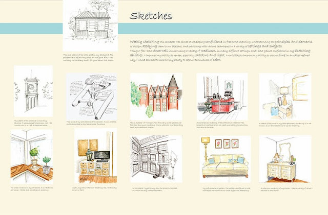
Reflection
Line, all sketches begin with line. It is such an important element when communicating a
design or idea.
The first way I have progressed in being able to communicate visually, is by
improving the quality if line in my sketches. One important lesson I have
learned is that less is more, and to make every line gesture count toward the
overall sketch composition. It is a very effective way of visual communication
to use fewer lines. Line weight is another important aspect to sketching. As
with all design, a good sketch or drawing should have an n established
hierarchy of line. This communicates the importance of features, as well as
emphasizing the principles of rhythm, repetition and contrast. The element of
line is something I will continue to focus on, and hopefully make more progress
on as I continue to learn and improve my freehand and drafted drawings.

A second way I have progressed in my
ability to communicate visually is by experimenting with different styles of
drawing. I have especially worked on communicating through a “looser” style.
The sketches and drawings I find most appealing have both a controlled aspect
and a “loose” aspect. I am at ease with the control, but have been working
toward a freer style. I have tried several ways to develop this style. One, I
have held my pencil, or drawing tool in a free, loose way, having a grip at the
end of the utensil away from the paper. I have also experimented with different
types of media to help develop a less constricted way of sketching.
Use of media is also something I have
worked on and developed this semester. I have used several types of media that
I have never used before, including oil pastels and xylene based markers. I
have also continued to refine my use of watercolor and colored pencil. Another
approach I have tried is to mix different types of media within one sketch or
drawing. The most successful being the use of colored pencil and marker
together. I will continue to try different types of media and mixing them in
new and different ways to create unusual effects that can further enhance my
drawings. I believe this will enhance what I have learned this far, and help me
to grow and learn in my ability to communicate visually.
Finally, and probably most importantly, I
have gained confidence in my abilities this semester. As my drawing and
sketching abilities have improved I have become more confident. I have
challenged myself to try new things and create more difficult sketches all
semester. I will continue to push myself, so I can be comfortable in my ability
to render, sketch and draw.
Friday, December 6, 2013
Design Firm Visit
Wednesday, November 27, I met with Nicole Diedrich from Susan Thorsen
Interiors in Kennewick WA. Nicole graduated from the American Institute of
Interior Design, located in Fountain Hills Arizona. She then worked in the
Seattle area for several years before settling in the Tri-Cities area. She has
worked at Susan Thorsen Interiors for several years.
Nicole primarily works in the residential sector of interior design, but
also does some light commercial work such as Doctor’s offices and an occasional
Winery. Much of the business at this firm is done with builders building new
homes, or residential remodel and renovation projects. Susan Thorsen is a
full-service design firm, providing everything from a simple consultation to
interior space planning, hard finish selections, window coverings and furniture
and accessories if needed. The showroom was filled with beautiful samples, and
thousands of choices. This firm specializes in the “hard”material aspects of interior
design, offering many flooring, counter, tile, paint and fixture choices.
Nicole typically gets input from the customer, whether it is in their showroom,
or at the client’s home. She then comes up with a plan that includes choices
for the client to review. After choices have been made, contractors and
sub-contractors are hired, and she is continually checking on the work progress
and the quality of work.
The aspects of the work Nicole enjoys most is working with the people,
and the creativity her job allows. She is very knowledgeable in all residential
materials, and knows what type of material will be best suited for her client.
Susan Thorsen Interiors pride themselves on providing quality selections,
products and installation on all their projects. They also feel that they
provide a value-added factor of expertise and knowledge, along with the
competitive prices they offer to their clients. Susan Thorsen has been in the
Tri-Cities for 25 years, and has built relationships with quality contractors
and sub-contractors in the area. Nicole told me they actually have a list of
“go-to” contractors that they routinely work with and look to for advice on
products and installation methods. They will not continue a professional
relationship with a contractor if they are not willing to stand behind the work
they do.
While Nicole did not have an aspect of her work that she disliked, she
did say that she missed creating project boards and drawings. I brought my
current studio project for her to look over, and she said the hand- work was
something she missed from her time at school. In their firm, they do not create
client boards, or do presentations. Nicole said this was too formal for the
type of client they find in this area. People in the Tri-Cities feel that
designers are expensive, and want the consultation at a minimum price. Not
spending the time to make boards, and do presentations not only saves them
time, but it also cuts down on costs. This was very surprising to me.
When I asked Nicole what the most frustrating part of working with
construction professionals was, she said it was their reluctance to use new or
different materials in the projects. Her comment was that they could be very
stubborn at times, and only wanted to use products and materials they were
familiar with and had worked with previously. She talked about the importance
of creating a network of people that are trusted and reliable to work with. In
the type of business they do, this is paramount. She felt that the reputation
of their firm was only as good as client’s response to what they provide. They
do not advertise, so word of mouth and client referrals are the primary source
of new business.
I had a great visit with Nicole; she was very informative and taught me
a lot about the type of business a small local firm like this does in Interior
Design. This was a wonderful experience, as the firms I have previously visited
have all been large. Having exposure to a different type of Interior Design
business helps me to determine where I might like to work and what types of
opportunities there may be for me once I graduate.
Subscribe to:
Posts (Atom)