Thursday, December 12, 2013

Reflection


Line, all sketches begin with line. It is such an important element when communicating a
design or idea. The first way I have progressed in being able to communicate visually, is by improving the quality if line in my sketches. One important lesson I have learned is that less is more, and to make every line gesture count toward the overall sketch composition. It is a very effective way of visual communication to use fewer lines. Line weight is another important aspect to sketching. As with all design, a good sketch or drawing should have an n established hierarchy of line. This communicates the importance of features, as well as emphasizing the principles of rhythm, repetition and contrast. The element of line is something I will continue to focus on, and hopefully make more progress on as I continue to learn and improve my freehand and drafted drawings.


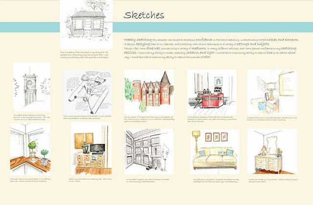
    A second way I have progressed in my ability to communicate visually is by experimenting with different styles of drawing. I have especially worked on communicating through a “looser” style. The sketches and drawings I find most appealing have both a controlled aspect and a “loose” aspect. I am at ease with the control, but have been working toward a freer style. I have tried several ways to develop this style. One, I have held my pencil, or drawing tool in a free, loose way, having a grip at the end of the utensil away from the paper. I have also experimented with different types of media to help develop a less constricted way of sketching.

     Use of media is also something I have worked on and developed this semester. I have used several types of media that I have never used before, including oil pastels and xylene based markers. I have also continued to refine my use of watercolor and colored pencil. Another approach I have tried is to mix different types of media within one sketch or drawing. The most successful being the use of colored pencil and marker together. I will continue to try different types of media and mixing them in new and different ways to create unusual effects that can further enhance my drawings. I believe this will enhance what I have learned this far, and help me to grow and learn in my ability to communicate visually.
     Finally, and probably most importantly, I have gained confidence in my abilities this semester. As my drawing and sketching abilities have improved I have become more confident. I have challenged myself to try new things and create more difficult sketches all semester. I will continue to push myself, so I can be comfortable in my ability to render, sketch and draw.
 

Friday, December 6, 2013

Design Firm Visit


     Wednesday, November 27, I met with Nicole Diedrich from Susan Thorsen Interiors in Kennewick WA. Nicole graduated from the American Institute of Interior Design, located in Fountain Hills Arizona. She then worked in the Seattle area for several years before settling in the Tri-Cities area. She has worked at Susan Thorsen Interiors for several years.

     Nicole primarily works in the residential sector of interior design, but also does some light commercial work such as Doctor’s offices and an occasional Winery. Much of the business at this firm is done with builders building new homes, or residential remodel and renovation projects. Susan Thorsen is a full-service design firm, providing everything from a simple consultation to interior space planning, hard finish selections, window coverings and furniture and accessories if needed. The showroom was filled with beautiful samples, and thousands of choices. This firm specializes in the “hard”material aspects of interior design, offering many flooring, counter, tile, paint and fixture choices. Nicole typically gets input from the customer, whether it is in their showroom, or at the client’s home. She then comes up with a plan that includes choices for the client to review. After choices have been made, contractors and sub-contractors are hired, and she is continually checking on the work progress and the quality of work.

     The aspects of the work Nicole enjoys most is working with the people, and the creativity her job allows. She is very knowledgeable in all residential materials, and knows what type of material will be best suited for her client. Susan Thorsen Interiors pride themselves on providing quality selections, products and installation on all their projects. They also feel that they provide a value-added factor of expertise and knowledge, along with the competitive prices they offer to their clients. Susan Thorsen has been in the Tri-Cities for 25 years, and has built relationships with quality contractors and sub-contractors in the area. Nicole told me they actually have a list of “go-to” contractors that they routinely work with and look to for advice on products and installation methods. They will not continue a professional relationship with a contractor if they are not willing to stand behind the work they do.

     While Nicole did not have an aspect of her work that she disliked, she did say that she missed creating project boards and drawings. I brought my current studio project for her to look over, and she said the hand- work was something she missed from her time at school. In their firm, they do not create client boards, or do presentations. Nicole said this was too formal for the type of client they find in this area. People in the Tri-Cities feel that designers are expensive, and want the consultation at a minimum price. Not spending the time to make boards, and do presentations not only saves them time, but it also cuts down on costs. This was very surprising to me.


     When I asked Nicole what the most frustrating part of working with construction professionals was, she said it was their reluctance to use new or different materials in the projects. Her comment was that they could be very stubborn at times, and only wanted to use products and materials they were familiar with and had worked with previously. She talked about the importance of creating a network of people that are trusted and reliable to work with. In the type of business they do, this is paramount. She felt that the reputation of their firm was only as good as client’s response to what they provide. They do not advertise, so word of mouth and client referrals are the primary source of new business.

     I had a great visit with Nicole; she was very informative and taught me a lot about the type of business a small local firm like this does in Interior Design. This was a wonderful experience, as the firms I have previously visited have all been large. Having exposure to a different type of Interior Design business helps me to determine where I might like to work and what types of opportunities there may be for me once I graduate.  

Saturday, October 5, 2013

Job Shadow

   While in Seattle, I was so fortunate to spend a day at the Gensler firm located on Sixth Avenue in downtown Seattle. It was an absolutely wonderful experience, and I would not change one thing about the entire day.
   The morning began with meeting Chelsea, a LEED certified designer in the firm.  She started with a tour of their office space. It is a beautiful space, and I am sure that clients are as comfortable as I was when I visited.  Chelsea was relaxed and friendly, and immediately I felt at ease. She showed the break-out rooms for small meetings, the living room that was used for meetings, or when the people working need a little more relaxed space could work. I toured the design library space, the kitchen, and the working spaces. Chelsea pointed out some of the projects, and models that people in the office were currently working on. A hotel project in Tahiti immediately caught my eye.
   After the tour, Chelsea took out the materials from the project she was working on. It included all the materials, as the project was ready for a client presentation that afternoon. I saw the plans, elevations, color schemes, and materials she had chosen to show the clients. It all was very inspiring, and I could definitely see myself doing this type of work.
   After Chelsea, I met with Jennifer. She is a Test Planner in the Gensler office. She showed us the project she was working on, and how she takes the program from the client, and tries different spaces to see if all the needs can be met within the space. She does this through bubble diagrams, and trace overlays. It was so educational to see her approach, and something I will take from for a long time.
   Jennifer passed me along to Kara. She took me to a project they had recently finished that she had been working on. It was so exciting to see the space, and hear about Kara’s job at Gensler. Kara is a design coordinator, which basically means that she is the one that plans all the components of a project, and makes sure they are all in sync.  She took us to the Glumac office space there in downtown. I t was such fun to see a completed project! I learned a lot about details, and things I hadn’t even thought about while I was with Kara. She definitely opened my eyes to job possibilities that I did not know about in the design world. Kara took me to the Seattle Convention Center for a wonderful, healthy lunch, and then we headed back to the Gensler office.
   Once we were back in the office, we saw a presentation from a furniture design company from London. It was a good experience, as I had never sat in on a presentation of this type. Their aesthetic was very clean and modern, and they had many good features to their designs. I especially appreciated the green aspect to their designs.
   Finally, I met with Stephanie de Villa and Savannah Barker. Stephanie is working on a project with Princess Cruise Lines, and talked a little about that. But what was really interesting to hear from these two, is how they go about getting new job opportunities in a sector of business they don’t currently have a large market share in. I heard how the developed a focus group, and things they did to try to obtain business in the restaurant and boutique sector. I am sure they will be successful at this, as they were both talented resourceful women.
I really could not have had a better Job Shadow experience. It was an inspiring day filled with inspiring people. I hope to be part of this exciting design world soon!

Z Home

   What an exciting experience visiting the Z-Home in Issaquah was! I have read and learned about sustainability and energy usage strategies, but to see it in a real space was a wonderful, and very educational time. The Z-Home definitely surpassed anything I had envisioned for this type of home. Initially the project looks like an upscale condominium or apartment complex. There is beautiful landscaping, and garden areas outside. I learned that the gardens, pavers and even the concrete used for the back driveways are all sustainable and eco-friendly. The concrete is porous, so the rain water can be absorbed into the ground, creating less runoff.

   Inside the home is equally impressive. There are beautiful, sustainable finishes everywhere, even the window are made of fiberglass frames, a strategy to create cleaner air in the home. It is really true in this home, that the beauty is deep within. It is considered a net-zero home, which means that there are no utility bills. They do this with solar panels on the roof of each residence, geo-thermal heating, and energy efficiency built into every square inch.  I learned that in these homes there is typically a small utility bill in the winter, but it is offset by the summer, when they are able to sell back energy to the power grid. It is a very informative, educational experience, and I think this is the building of the future. At least, I hope it will be.

Frye Art Museum


   During my day of touring around Seattle, I visited the Frye Art Museum. It is also located on Capitol Hill in Seattle. From the outside, the museum look rather ordinary, but once you reach the entrance, is when you see the beautiful architecture begin.
   The entrance is a series of arches, or an archade, made of bare concrete. The simplicity of the material fits perfectly with the honest straightforward design. Rick Sundberg, the architect that did the design, was there and talked about how he wanted the entrance to be an experience. His vision was to prepare visitors to see the art in the museum. He spoke of how we all come to buildings equally, and how the arches were set up in a sequence with the water pool to create a sense of calm before entering the structure.

   Inside, the rotunda is the star of the building. It has a domed ceiling that is a perfect sphere. The rotunda, the sphere, and the entire building are based on the golden section. Even the pavers are based on this geometric theme.  Mr. Sundberg also talked of the buildings theme on light, and how it is used to move people through the space. The light enters through windows a s well as shafts that stream light into the space. It was definitely am inspiring space, with many great ways of playing with light in an interior space.

Sketch Crawl

Saturday morning, I got up, grabbed some coffee, and was headed to Seattle Center. I was going on a sketch-crawl! It was a meet-up of sorts with the local Urban Sketchers group. Now, I wasn’t quite sure what to expect. Were we going to crawl or lie on the ground to sketch? Would we all sketch the same thing?
   It turns out neither of those things happened. I met them in the Seattle Center food court, got acquainted and saw some of their amazing, inspiring work, and headed out to sketch, with a plan of getting back together after an hour.
   First, I will tell you a bit about the Urban Sketchers organization. They are a group that meets about once a month to sketch. They feel strongly that there is an educational, storytelling aspect to location drawing. Their aim is to tell a story of their surroundings and to record the time and place. Urban Sketchers have a network of blogs, and a Flickr group to share their work with others.

   I choose for my sketch to do the newly installed “sonic bloom”. Sonic Bloom is a motion-activated set of giant flowers that create noise when there is motion nearby. The set of five flowers are solar-powered, and they bask colored light over the Seattle center at night. While I was there in the daylight, it was still a fun and unusual thing to sketch.

The Chapel of Saint Ignatius

   The Chapel of Saint Ignatuis is located on the top of Seattle’s Capitol Hill area, on the campus of Seattle University.  It is the main chapel on the Catholic University’s campus. I was there to study and enjoy the creation by architect Steven Holl. He based his design on the Catholic worship story of “seven bottles in a stone box”. Light passes through various colored glass windows into each “bottle”, defining each space through light and color. It is not difficult to see, and even feel the building’s theme of bringing light to life. It is so masterfully done, with direct light, reflected light, indirect light, shade and shadow.
   The interior walls are almost entirely made of white plaster, tooled with a 12” serrated trowel. Even this most basic material is brought to life through the light. The designers of this space felt this white light was a metaphor for the collective students at Seattle University coming together.
   There were many aspects of this building that caught my attention. First, the door and its beautiful bronze handle. Architect Jim Graham spoke of the handle as being “the handshake of the building” It is the feature most often touched by anyone who enters, and may be the only thing they touch. It is therefore important that the handle be beautiful and comfortable to touch.


   A second detail that caught my eye, were the bronze pieces on the building exterior. I took time to sketch one, but could not figure out what their purpose might be. Mr. Graham was kind enough to explain them, and the story was fascinating. He told how the concrete walls were poured into slabs, but they wanted the top of the slab to face the building’s exterior, which is not the norm. For this reason, they needed to place metal hooks into the concrete, so they could hoist the slabs into their vertical position. Instead of just using rebar, or something just totally utilitarian, they made the pieces part of the design. The pieces are cast bronze, sculpted from a cast of an old Japanese fishing float. One can even see the wood grain from the float in the bronze. It was very inspiring to see beauty and function working together in harmony. That is how I felt about the entire space, beauty, function and inspiration all working together. Exactly what a Chapel or Church should be.

325 Westlake

In Seattle, I was fortunate enough to be able to visit a construction job site, located at 325 Westlake in Seattle. The building was right in the middle of the construction phase. This is a remodel of an existing building plus an addition “the tower”. The tower is a five story apartment complex with twelve 700 to 800 square foot apartments, and a fifth floor penthouse suite with a large outdoor area. The existing first floor and loft space are to house an art facility for local artists and an office space in the loft.
   I donned my hardhat and toured the space with Leann, an architect from the Graham Baba firm. Leann mentioned the design was based on a raw, clean aesthetic. Instead of covering the buildings infrastructure, they wanted people to see what is behind the design. They tried to avoid layering sheetrock over functional elements, and instead left most of the original structure exposed. This translated to brick and pipes exposed in a beautiful, simple, industrial manner.

  I learned a lot from this visit. Just listening to Leann speaks of the building in design terms, how they designed with beauty and livability in mind. I hope I will be able to visit again once the project is complete to see the entire vision come to fruition.

New Horizons Shelter and Street Bean Espresso

   While in Seattle, one of the most inspiring places I visited was the New Horizons Teen Shelter and Street Bean Espresso. The tour began with the teen shelter, and the re-purposed loading dock they now use for an entrance. The teens can wait in this small area out of the cold and rain before the shelter opens.
   I was then led into the facility and upstairs to a meeting room. Street Bean is a faith-based non-profit shelter. They provide food, shelter, clothing, laundry and showers to homeless teens in Seattle. They average 30-40 teens as walk-in each night. They would like to have some semi-permanent rooms for the teens that are regular users of the facility and have proven to be working toward a better life.
  From a design standpoint, the space was nothing special. Street Bean needs the space to be welcoming, safe and efficient. They also need a place for the kids to feel safe, and be able to decompress from the streets. The space they have takes a lot of abuse, so durability is definitely a factor. Safety is, of course, the main concern. Therefore, the space needs to be open, so monitoring the kids can be done easily and constantly. They also need a flexible and adaptable space, as there are many different activities that take place there.

   Street Bean’s biggest concern is to get the teens ready for work. The teens that are provided with food and shelter are asked to work in the Espresso Shop located across the street. The coffee shop provides on the job training for the teens, as well as a source of income for the shelter. Truly Street Bean provides more than beds, food, and job training for homeless Seattle teens. Street Bean provides hope. Hope for a better future and a better life. Hopefully some good design implemented into their space can help provide an even brighter outlook for these teens.

Saturday, September 14, 2013

Ride, Don't Walk

The start of my ride!!

I recently experienced a one hour ride in a wheelchair. Some of it was really fun, some difficult and some downright frustrating.
  I began by wheeling into the elevator, which sounds quite easy, but took a few minutes to get the ability to steer, move forward, and fit within the confines of the door coordinated. Once in the elevator the ability to turn completely around took a minute too, so clearly I wasn't going to get anywhere too quickly.
  The difficult part was trying to get through a doorway that did not have a handicapped accessibility automatic opener. Trying to open the door, hold it open and negotiate through it all at once was hard. I did manage to accomplish the task, but it wasn't graceful. I should say that the building I was in was an accessible building, but definitely only parts were truly accessible.

Bathrooms were a point in case. Some of the accessible bathrooms were fine, and I could tell that using  it and turning around to get out would not be a problem. Others, that were supposedly accessible, were unusable. I could not even get the wheelchair into the stall, let alone turn myself around.
The fun part came going out of the building to the next building. There is an incline between the buildings, which was really fun to roll down. Good thing for brakes, that is all I am saying.

The frustrating part was again door related. This building is an accessible building, and has the automatic openers at the exterior doors. They are located close enough to the doors, and at a good height, but the first is on the left side, and the second on the right. This means that if there are others using the doorway, the wheelchair person has to cross the line of traffic to operate the doors. I feel that this is a design flaw. I think all designers of the built environment should spend some time in a wheelchair. Maybe an oversight like this could be avoided in the future.

Sunday, September 8, 2013

Habitat for Humanity Build

 
 My volunteer day began at Starbucks, with coffee and a bite to eat, where I met a couple of my colleagues. Once everyone arrived, we hopped into my car and drove the short distance from Pullman to Albion, where the Habitat for Humanity house was located.  We unloaded, had a brief safety talk, got signed in, and then Bob, one of the Habitat regulars told us a bit about the Habitat for Humanity organization in general, the particular house were  working on, and the family that would occupy the home. It was fun to hear about the family, as it brought it to a personal level for all of the volunteers.

Bob, our fearless leader, in the trenches.


The first task we were assigned was to level out 6" to 8 " out from the foundation base so that a drainage pipe could be put into place. This meant picking up the chunks of concrete, some of which had to be broken away, and removing it from the foundation area. Then the pipe could be placed.
 

The pipe after placement

After the drainage pipe was laid, the foundation was "painted" with a coat of tar. This, I learned would create a moisture barrier, so the foundation would not mildew or warp due to moisture. Once the tar was on, we added a layer of gravel. I learned we were using 2" gravel because it was better for drainage, and would not pack down easily.
Sometime during this process we broke for a quick lunch and water break. After our
 re-fueling, we went right back to working on drainage for the foundation and eventually another layer of pipe for the roof drains. This meant more gravel, and more shoveling for me. I did spread tar for a little while, but for most of the day I shoveled and hauled gravel.
It was a day of hard work, teamwork and getting things done. I learned a lot, met some very nice people, and I felt good about what we had accomplished for a very deserving organization. 


Sunday, August 25, 2013

What is Home?

Home Sketch
  What is home? I am sure the answer to that question is as varied as the people on the earth. Many things play a part in what one thinks of when they hear the word "home".
  For me , the answer to that question has changed drastically in the past year. My growing-up years were essentially spent in one small town house. It was a home filled with family, and music, as both of my parents were music teachers. I can remember my Mother sitting down at the piano to play Claude Debussy's "Clair de Lune" before dinner, it was a favorite of hers. She also taught piano lessons, and my Dad loved all classical and jazz music, so the stereo was most often playing something.
 
My Mother's Piano
 

Then I got married. We moved a few times, but finally settled in a small town. We raised our two children in this home. I lovingly took care of the 1906 farmhouse that we bought through farm auction. It was originally built by my husband's great-grandfather as a wedding gift for his bride. I was proud to take care of this beautiful home, as I painted, sanded floors, redesigned and updated her. I am still proud of how much love I put into that place to make it a home.
1906 Farmhouse

 Exactly a year ago today, my husband asked me for a divorce. I moved away from his family home to create a home just for me. This is something I had never done before. What I have discovered in this process, is that home is not a certain place, it can be anywhere. I now live in a 500 square foot studio apartment. It is my home. Home for me only needs a few things; at least one comfortable chair to read in, an outdoor chair to drink a cup of tea, a few flowers in a pot or vase, and of course, it must have music to fill my soul.
 My Patio Space


Friday, July 26, 2013

Seat and Shelter


After researching Baroque architecture, and creating abstract forms, it was time to create something new from these abstractions. I did a seat and shelter structure.Above are the drafted drawings of my structure, and the materials I envisioned using. I incorporated the visual texture in the stained concrete, and textured canvas of the awning.Here is the model I made to a 1'0"=1" scale.


Finally, I also drafted a plan view, and did a rendered sketch of my model.The photos on this poster are taken at 9am, noon, and 4pm to show the progression of the sun on the shelter. If I were to build this, I would shift the orientation, so that the shade would be over the seat.

The Spiritual Curve

 The Spiritual Curve is a metaphor I came up with to represent the curved line found in Baroque architecture and the religious nature of the time period. The title also has meaning to me personally, as I have been on a new journey myself.
 The inspiration came from the architect Jules Mansart, who designed for King Louis XIV. Mansart designed the Hall of Mirrors at the Palace of Versaille, and other Baroque structures. I then found a natural inspiration that in some way represented this time period. I chose a Florida coneshell. I felt this represented the curved line, visual texture, radial balance and rhythm through repetition that I was seeing In My Barouque Time Period.
 I then did realistic drawings of the shell, and small thumbnail sketches of it's parts and elements. From there I abstracted the elements and principles of design and sketched thumbnails of my abstractions.After the 2 dimensional drawings were complete, I then took these to 3 dimensions, by making small informal study models.
 Finally, through the process of hard work and editing, I came up with  a final abstract model.See it here

Morrill Hall

A 2 point exterior sketch I did of Morrill Hall. Again, this is on the campus of WSU. I would like to improve my skills in this type of sketch, as this one is a little bit skewed. I am improving my skills in sketching trees and bushes, so I know I will improve in these perspective sketches too. The thing I do like about this sketch is the use of value achieved in the graphite.

2 Point Perspective

This is my first 2 point perspective. I did a corner in my little apartment. While I like the range of value I achieved in this sketch, I wish I would have used a little more white. These windows are one of the reasons I rented this space, I just adore all the light they bring into my tiny place!

College Hall Sketch

This is College Hall on the campus of WSU. I love the buildings on this campus, many of them are this old style of architecture, and have such great detail.It makes for a challenging perspective sketch, but it is a fun challenge for me. I see in this work that I would like to improve upon my sketching of plant materials, and the perspective is a little off. I guess i need to pay more attention to these things while I am sketching.

A Favorite Way to Sketch

Take a nice warm summer evening, or afternoon, add a glass of wine, a good friend, and a sketch, and you have my recipe for a very enjoyable time! For this sketch, I did one study in graphite, and another in ink using a hatching technique for the shading. Combining the elements of shading and perspective drawing proved to be easier than i thought it might be, maybe it was the wine!

Stairs- Shade and Shadow

Studying the shade and and shadow that the stair railing makes on the concrete is a nice way to spend a summer afternoon in my book. I enjoyed this sketch, and learned how to look at shade and shadows that structures cast in a whole new way.

Leaves


I like this little sketch of negative space around a group of leaves. I darkened the edges of the forms around the leaves so the spaces would not seem so flat. I also shaded the area in a flowing pattern to give the background some movement. I feel it is important to see the shapes that the negative space makes, it can be so interesting.

Final Concept Model

Here is the final concept model I constructed in 3-Dimensions. The elements and principles of design I tried to pull out of my previous work were, curved line, rhythm through repetition. and visual texture. I feel I accomplished my goal, and this piece is now truly 3-dimensional. My previous models were merely enlarged lines, but not really meant to be seen from all sides. It has been a struggle to get to this point conceptually, as I have not done very much work in the abstract. While I have enjoyed the process, I hope to grow and get more adept and quicker in this process

Fruit Watercolor

For this sketch, I started with a little value sketch of a fruit grouping. Luckily I love fruit, and had plenty to choose from on hand! After my initial sketch, I took a piece of watercolor paper, and did the same grouping in watercolor. The background seemed very flat and white, so I added a little color wash to liven up the composition. I like how this piece turned out, a little bit controlled, and a little bit free flowing. I enjoy doing these types of studies, and hope to do more in the future.

Update on Design in 3 Dimensions

Here is an update on designing in 3 Dimensions.I took one of my favorite models an spliced it apart, then reconfigured it and glued it back together.I like the way this model is interesting from all angles, but it now lacks the fluid form and curved line that I am looking for.

Napkin Sketch

Here is a small sketch I did on a napkin. No measurements were used, just tried to "eyeball" it.  I also had trouble with the perspective and horizon line. But I like to do small quick sketches that are informal, as this one is.


Chair Study

For this sketch I drew and dimensioned a chair in my place.  While it is not perfect ( the seat should be flat on the side and back view), I am happy with the dimensioning. I feel it is a good representation of the chair, and fairly accurately shows the size and scale.

Wednesday, July 10, 2013

Design in 3 Dimensions

To take the abstractions I had sketched from 2 dimensions to 3 dimensions, I made forms out of chipboard. This material worked well, because it allows the form to be seen without any added color or differing surface areas. I only wish I had not chosen such a heavy chipboard. My fingers and hands paid the price for the thickness of this material. This process was inspiring,and I felt that the further I worked, the more ideas I had. I still see ways that I can take my designs further by tweaking the forms and adding and subtracting elements.

Concept Design in 2 Dimensions

As concept design began, I  found an object that in some way that had elements of design from the Baroque Period of Design. I chose a shell because of the curved lines and the domed shape of the cap.Then I proceeded to realistic drawings of my "found" object, which I did in graphite. I enjoyed doing these sketches, and felt that they were good representations of the shell that I began with. I always feel comfortable using graphite and thought that the shading and detail of the sketches was good.
The next step in my design process was to do thumbnail sketches to abstract the realistic images. I was purely looking at the elements and principles of design. Things that came to my mind, were radial symmetry, texture,curved line,rhythm and form, among others. While I enjoyed the abstractions, and have learned so much from doing them,  now I look back, and see other directions that I might have explored.

Tuesday, July 9, 2013

Tessellation


As I reflect upon my tessellation project, I have some remorse. While I learned so much doing this, I am not happy with the final product. I began with photos from the Baroque Period, then morphed them in Photoshop. I had several photos that never made it to my final product so I could have an analogous color scheme.  I had a clear vision of where I wanted this project to end at, but I was not able to make my vision happen. Hopefully with more technical skill I will be able to get closer to what I envision in the future.

Monday, July 1, 2013

Palouse Sketch


This is my first effort with the Wacom tablet, a computerized drawing tool. While I am definitely not proficient with this tool, I enjoyed using it and I am pleased with my result. I am hoping as time goes on, and I have more practice, I will feel more comfortable with this form of media. I like the line created, but did not realize that the line was not complete on the right horizon, and would  like that line to come to the edge of the picture. I am proud of  the painterly effect I created in this work,a skill I would like to build upon.