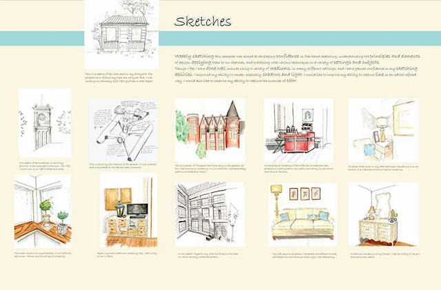
A post of sketches from Florence would not be complete without one of the Duomo, or Cathedral Santa Maria del Fiore.
Showing posts with label Reflections. Show all posts
Saturday, July 2, 2016
Friday, May 2, 2014
A New Path
Pullman Train Depot Project
The train depot project had several facets to the design program criteria. First was the adaptive re-use of the historical train depot, built in the late 1800's. next, was incorporating an artist's studio and gallery display space, and a 1200 sq. ft. living space into the structure. The third criteria was to add ADA, vision impairment and universal design requirements. Finally, the program was to include my design concept, and inspiration from my artists work.
The inspiration for this design was a crack in the concrete foundation of the depot. I focused on the elements of line, texture and contrast, and through exploration I came to a final parti design.
This design was re-sized and colored in photoshop, then put into a pattern to develop my textile. I found this to be very rewarding, as receiving my fabric was the first time I have seen one of my designs come to life! I definitely improved my skills in photoshop during the textile design. I would like to continue to improve, as photoshop has so many options and things to know about the program and how to design with it.
Another part of the design process I really enjoy is concept development. The 2-dimensional parti was used to create a 3-dimensional concept model. During this process I made several process models, until I finally came up with one worthy of making into a final model. I focused again on texture, line and contrast. I also had in mind the idea of the structural concrete form with a very organic crack in it. The idea of random versus a prescribed path came to my mind. We all have a trail through life, and wonder if it is predestined or simply random. Our paths with cross, diverge and intersect with each other. I thought about the paths of people that had taken the train to Pullman years ago to attend WSU. I thought of my own path, this new path of going back to school. The title of my project derived from this compilation of thoughts, and my model was titled "A New Path".
I learned through all of this that I could translate a very personal concept to include general themes. After all, we all have hard times and fears to deal with along our path.
Another step in my design process was to incorporate my concept, the research on universal design, ADA and vision impairment and blend it with my artists' work. The colors I chose came from the artwork directly. I challenged myself to use orange, a color I don't care for. Space planning was incorporated, and the design started to take shape. I began with small idea sketches,and worked on a couple of large perspectives. Details were added and changed along the way to create a harmonious design. In my gallery space, I designed every component, from the lighting, the cloud to the moveable walls and reception desk. I even designed a stream to run through the floor to incorporate my organic path. I learned that with some experimentation and design work, I could use a color I dislike to create a design I love!
Then came the final model. This was a challenge for me. The model is at 1/8" =1" scale, so it is small, and difficult to capture the details, especially when all the cutting is done by hand. Add to that the many doors and windows, the sloping eves, the parapet walls, and you have a complicated model. Oh yes, and building a roof to fit! The model was not easy, but I exercised patience, and methodical measuring. My model turned out well, and I learned that I could figure out the geometry with only minor flaws.
I also continue to learn how to solve design problems. The ADA bathrooms in the gallery area were a puzzle for me. There was enough footage for two bathrooms, but the existing windows proposed problems when trying to divide the space. My solution was to divide the space diagonally, making sure I had a 60" wheelchair turnaround, places to locate grab bars, and a t least a 36" counter for a sink. In the real world the design may not work, but at least I solved the problem in a way that met the requirements for the space.
Overall I feel I improved in several ways. First, my time management was much better, I never felt stressed or behind. I also incorporated a concept with historical preservation in a design I am proud of. I have not worked in a historical context, so this was new for me. Finally the scope of the design was larger, and on several occasions I needed to come up with solutions to design problems I solved the problems to the best of my ability, and stretched myself to create something unlike anything I had done previously.
The train depot project had several facets to the design program criteria. First was the adaptive re-use of the historical train depot, built in the late 1800's. next, was incorporating an artist's studio and gallery display space, and a 1200 sq. ft. living space into the structure. The third criteria was to add ADA, vision impairment and universal design requirements. Finally, the program was to include my design concept, and inspiration from my artists work.
The inspiration for this design was a crack in the concrete foundation of the depot. I focused on the elements of line, texture and contrast, and through exploration I came to a final parti design.
This design was re-sized and colored in photoshop, then put into a pattern to develop my textile. I found this to be very rewarding, as receiving my fabric was the first time I have seen one of my designs come to life! I definitely improved my skills in photoshop during the textile design. I would like to continue to improve, as photoshop has so many options and things to know about the program and how to design with it.
Another part of the design process I really enjoy is concept development. The 2-dimensional parti was used to create a 3-dimensional concept model. During this process I made several process models, until I finally came up with one worthy of making into a final model. I focused again on texture, line and contrast. I also had in mind the idea of the structural concrete form with a very organic crack in it. The idea of random versus a prescribed path came to my mind. We all have a trail through life, and wonder if it is predestined or simply random. Our paths with cross, diverge and intersect with each other. I thought about the paths of people that had taken the train to Pullman years ago to attend WSU. I thought of my own path, this new path of going back to school. The title of my project derived from this compilation of thoughts, and my model was titled "A New Path".
I learned through all of this that I could translate a very personal concept to include general themes. After all, we all have hard times and fears to deal with along our path.
Another step in my design process was to incorporate my concept, the research on universal design, ADA and vision impairment and blend it with my artists' work. The colors I chose came from the artwork directly. I challenged myself to use orange, a color I don't care for. Space planning was incorporated, and the design started to take shape. I began with small idea sketches,and worked on a couple of large perspectives. Details were added and changed along the way to create a harmonious design. In my gallery space, I designed every component, from the lighting, the cloud to the moveable walls and reception desk. I even designed a stream to run through the floor to incorporate my organic path. I learned that with some experimentation and design work, I could use a color I dislike to create a design I love!
Then came the final model. This was a challenge for me. The model is at 1/8" =1" scale, so it is small, and difficult to capture the details, especially when all the cutting is done by hand. Add to that the many doors and windows, the sloping eves, the parapet walls, and you have a complicated model. Oh yes, and building a roof to fit! The model was not easy, but I exercised patience, and methodical measuring. My model turned out well, and I learned that I could figure out the geometry with only minor flaws.
I also continue to learn how to solve design problems. The ADA bathrooms in the gallery area were a puzzle for me. There was enough footage for two bathrooms, but the existing windows proposed problems when trying to divide the space. My solution was to divide the space diagonally, making sure I had a 60" wheelchair turnaround, places to locate grab bars, and a t least a 36" counter for a sink. In the real world the design may not work, but at least I solved the problem in a way that met the requirements for the space.
Overall I feel I improved in several ways. First, my time management was much better, I never felt stressed or behind. I also incorporated a concept with historical preservation in a design I am proud of. I have not worked in a historical context, so this was new for me. Finally the scope of the design was larger, and on several occasions I needed to come up with solutions to design problems I solved the problems to the best of my ability, and stretched myself to create something unlike anything I had done previously.
Wednesday, April 16, 2014
Sherwin Williams Stir Competition
During The design process for the re-use of the Pullman Depot, I made a poster to submit for the Sherwin Williams Stir Competition. I drew three perspective drawings, and rendered them in the Sherwin Williams colors I had chosen for the space. This was a fun learning experience because in reality this is what we will be doing. We need to know not only how to combine colors to form a pleasing palette, but we must be able to represent them accurately in our drawings and renderings.
The colors I chose are taken from the artist I used for gallery inspiration. I used the Chip-it tool from Sherwin Williams to accurately match the colors in her artwork to Sherwin Williams paint colors. This builds on the theories of special organization I have been learning all semester. I am also building on the skills of selecting appropriate finishes for furnishings and materials for this setting, and for ADA and Universal Design compliance.
The poster was also a good reason to practice graphic presentation skills. I like the way my poster is coming along and feel more comfortable with the process and outcome each time I do a graphic representation of this kind.
The colors I chose are taken from the artist I used for gallery inspiration. I used the Chip-it tool from Sherwin Williams to accurately match the colors in her artwork to Sherwin Williams paint colors. This builds on the theories of special organization I have been learning all semester. I am also building on the skills of selecting appropriate finishes for furnishings and materials for this setting, and for ADA and Universal Design compliance.
The poster was also a good reason to practice graphic presentation skills. I like the way my poster is coming along and feel more comfortable with the process and outcome each time I do a graphic representation of this kind.
Thursday, December 12, 2013
Reflection
Line, all sketches begin with line. It is such an important element when communicating a
design or idea.
The first way I have progressed in being able to communicate visually, is by
improving the quality if line in my sketches. One important lesson I have
learned is that less is more, and to make every line gesture count toward the
overall sketch composition. It is a very effective way of visual communication
to use fewer lines. Line weight is another important aspect to sketching. As
with all design, a good sketch or drawing should have an n established
hierarchy of line. This communicates the importance of features, as well as
emphasizing the principles of rhythm, repetition and contrast. The element of
line is something I will continue to focus on, and hopefully make more progress
on as I continue to learn and improve my freehand and drafted drawings.

A second way I have progressed in my
ability to communicate visually is by experimenting with different styles of
drawing. I have especially worked on communicating through a “looser” style.
The sketches and drawings I find most appealing have both a controlled aspect
and a “loose” aspect. I am at ease with the control, but have been working
toward a freer style. I have tried several ways to develop this style. One, I
have held my pencil, or drawing tool in a free, loose way, having a grip at the
end of the utensil away from the paper. I have also experimented with different
types of media to help develop a less constricted way of sketching.
Use of media is also something I have
worked on and developed this semester. I have used several types of media that
I have never used before, including oil pastels and xylene based markers. I
have also continued to refine my use of watercolor and colored pencil. Another
approach I have tried is to mix different types of media within one sketch or
drawing. The most successful being the use of colored pencil and marker
together. I will continue to try different types of media and mixing them in
new and different ways to create unusual effects that can further enhance my
drawings. I believe this will enhance what I have learned this far, and help me
to grow and learn in my ability to communicate visually.
Finally, and probably most importantly, I
have gained confidence in my abilities this semester. As my drawing and
sketching abilities have improved I have become more confident. I have
challenged myself to try new things and create more difficult sketches all
semester. I will continue to push myself, so I can be comfortable in my ability
to render, sketch and draw.
Friday, December 6, 2013
Design Firm Visit
Wednesday, November 27, I met with Nicole Diedrich from Susan Thorsen
Interiors in Kennewick WA. Nicole graduated from the American Institute of
Interior Design, located in Fountain Hills Arizona. She then worked in the
Seattle area for several years before settling in the Tri-Cities area. She has
worked at Susan Thorsen Interiors for several years.
Nicole primarily works in the residential sector of interior design, but
also does some light commercial work such as Doctor’s offices and an occasional
Winery. Much of the business at this firm is done with builders building new
homes, or residential remodel and renovation projects. Susan Thorsen is a
full-service design firm, providing everything from a simple consultation to
interior space planning, hard finish selections, window coverings and furniture
and accessories if needed. The showroom was filled with beautiful samples, and
thousands of choices. This firm specializes in the “hard”material aspects of interior
design, offering many flooring, counter, tile, paint and fixture choices.
Nicole typically gets input from the customer, whether it is in their showroom,
or at the client’s home. She then comes up with a plan that includes choices
for the client to review. After choices have been made, contractors and
sub-contractors are hired, and she is continually checking on the work progress
and the quality of work.
The aspects of the work Nicole enjoys most is working with the people,
and the creativity her job allows. She is very knowledgeable in all residential
materials, and knows what type of material will be best suited for her client.
Susan Thorsen Interiors pride themselves on providing quality selections,
products and installation on all their projects. They also feel that they
provide a value-added factor of expertise and knowledge, along with the
competitive prices they offer to their clients. Susan Thorsen has been in the
Tri-Cities for 25 years, and has built relationships with quality contractors
and sub-contractors in the area. Nicole told me they actually have a list of
“go-to” contractors that they routinely work with and look to for advice on
products and installation methods. They will not continue a professional
relationship with a contractor if they are not willing to stand behind the work
they do.
While Nicole did not have an aspect of her work that she disliked, she
did say that she missed creating project boards and drawings. I brought my
current studio project for her to look over, and she said the hand- work was
something she missed from her time at school. In their firm, they do not create
client boards, or do presentations. Nicole said this was too formal for the
type of client they find in this area. People in the Tri-Cities feel that
designers are expensive, and want the consultation at a minimum price. Not
spending the time to make boards, and do presentations not only saves them
time, but it also cuts down on costs. This was very surprising to me.
When I asked Nicole what the most frustrating part of working with
construction professionals was, she said it was their reluctance to use new or
different materials in the projects. Her comment was that they could be very
stubborn at times, and only wanted to use products and materials they were
familiar with and had worked with previously. She talked about the importance
of creating a network of people that are trusted and reliable to work with. In
the type of business they do, this is paramount. She felt that the reputation
of their firm was only as good as client’s response to what they provide. They
do not advertise, so word of mouth and client referrals are the primary source
of new business.
I had a great visit with Nicole; she was very informative and taught me
a lot about the type of business a small local firm like this does in Interior
Design. This was a wonderful experience, as the firms I have previously visited
have all been large. Having exposure to a different type of Interior Design
business helps me to determine where I might like to work and what types of
opportunities there may be for me once I graduate.
Saturday, October 5, 2013
Job Shadow
While in Seattle, I was so fortunate to
spend a day at the Gensler firm located on Sixth Avenue in downtown Seattle. It
was an absolutely wonderful experience, and I would not change one thing about
the entire day.
The morning began with meeting Chelsea, a
LEED certified designer in the firm. She
started with a tour of their office space. It is a beautiful space, and I am
sure that clients are as comfortable as I was when I visited. Chelsea was relaxed and friendly, and
immediately I felt at ease. She showed the break-out rooms for small meetings,
the living room that was used for meetings, or when the people working need a
little more relaxed space could work. I toured the design library space, the
kitchen, and the working spaces. Chelsea pointed out some of the projects, and
models that people in the office were currently working on. A hotel project in
Tahiti immediately caught my eye.
After the tour, Chelsea took out the
materials from the project she was working on. It included all the materials,
as the project was ready for a client presentation that afternoon. I saw the
plans, elevations, color schemes, and materials she had chosen to show the
clients. It all was very inspiring, and I could definitely see myself doing
this type of work.
After Chelsea, I met with Jennifer. She is a
Test Planner in the Gensler office. She showed us the project she was working
on, and how she takes the program from the client, and tries different spaces
to see if all the needs can be met within the space. She does this through
bubble diagrams, and trace overlays. It was so educational to see her approach,
and something I will take from for a long time.
Jennifer passed me along to Kara. She took
me to a project they had recently finished that she had been working on. It was
so exciting to see the space, and hear about Kara’s job at Gensler. Kara is a
design coordinator, which basically means that she is the one that plans all
the components of a project, and makes sure they are all in sync. She took us to the Glumac office space there
in downtown. I t was such fun to see a completed project! I learned a lot about
details, and things I hadn’t even thought about while I was with Kara. She
definitely opened my eyes to job possibilities that I did not know about in the
design world. Kara took me to the Seattle Convention Center for a wonderful,
healthy lunch, and then we headed back to the Gensler office.
Once we were back in the office, we saw a
presentation from a furniture design company from London. It was a good
experience, as I had never sat in on a presentation of this type. Their
aesthetic was very clean and modern, and they had many good features to their
designs. I especially appreciated the green aspect to their designs.
Finally, I met with Stephanie de Villa and
Savannah Barker. Stephanie is working on a project with Princess Cruise Lines,
and talked a little about that. But what was really interesting to hear from
these two, is how they go about getting new job opportunities in a sector of
business they don’t currently have a large market share in. I heard how the developed
a focus group, and things they did to try to obtain business in the restaurant
and boutique sector. I am sure they will be successful at this, as they were
both talented resourceful women.
Z Home
What an exciting experience visiting the
Z-Home in Issaquah was! I have read and learned about sustainability and energy
usage strategies, but to see it in a real space was a wonderful, and very
educational time. The Z-Home definitely surpassed anything I had envisioned for
this type of home. Initially the project looks like an upscale condominium or
apartment complex. There is beautiful landscaping, and garden areas outside. I
learned that the gardens, pavers and even the concrete used for the back driveways
are all sustainable and eco-friendly. The concrete is porous, so the rain water
can be absorbed into the ground, creating less runoff.
Inside the home is equally impressive. There
are beautiful, sustainable finishes everywhere, even the window are made of
fiberglass frames, a strategy to create cleaner air in the home. It is really
true in this home, that the beauty is deep within. It is considered a net-zero
home, which means that there are no utility bills. They do this with solar
panels on the roof of each residence, geo-thermal heating, and energy
efficiency built into every square inch.
I learned that in these homes there is typically a small utility bill in
the winter, but it is offset by the summer, when they are able to sell back
energy to the power grid. It is a very informative, educational experience, and
I think this is the building of the future. At least, I hope it will be.
Frye Art Museum
During my day of touring around Seattle, I
visited the Frye Art Museum. It is also located on Capitol Hill in Seattle.
From the outside, the museum look rather ordinary, but once you reach the
entrance, is when you see the beautiful architecture begin.
The entrance is a series of arches, or an
archade, made of bare concrete. The simplicity of the material fits perfectly
with the honest straightforward design. Rick Sundberg, the architect that did
the design, was there and talked about how he wanted the entrance to be an
experience. His vision was to prepare visitors to see the art in the museum. He
spoke of how we all come to buildings equally, and how the arches were set up
in a sequence with the water pool to create a sense of calm before entering the
structure.
Inside, the rotunda is the star of the
building. It has a domed ceiling that is a perfect sphere. The rotunda, the
sphere, and the entire building are based on the golden section. Even the
pavers are based on this geometric theme.
Mr. Sundberg also talked of the buildings theme on light, and how it is
used to move people through the space. The light enters through windows a s
well as shafts that stream light into the space. It was definitely am inspiring
space, with many great ways of playing with light in an interior space.
Sketch Crawl
Saturday
morning, I got up, grabbed some coffee, and was headed to Seattle Center. I was
going on a sketch-crawl! It was a meet-up of sorts with the local Urban
Sketchers group. Now, I wasn’t quite sure what to expect. Were we going to
crawl or lie on the ground to sketch? Would we all sketch the same thing?
It turns out neither of those things
happened. I met them in the Seattle Center food court, got acquainted and saw
some of their amazing, inspiring work, and headed out to sketch, with a plan of
getting back together after an hour.
First, I will tell you a bit about the Urban
Sketchers organization. They are a group that meets about once a month to
sketch. They feel strongly that there is an educational, storytelling aspect to
location drawing. Their aim is to tell a story of their surroundings and to
record the time and place. Urban Sketchers have a network of blogs, and a
Flickr group to share their work with others.
I choose for my sketch to do the newly
installed “sonic bloom”. Sonic Bloom is a motion-activated set of giant flowers
that create noise when there is motion nearby. The set of five flowers are
solar-powered, and they bask colored light over the Seattle center at night.
While I was there in the daylight, it was still a fun and unusual thing to
sketch.
The Chapel of Saint Ignatius
The Chapel of Saint Ignatuis is located on
the top of Seattle’s Capitol Hill area, on the campus of Seattle
University. It is the main chapel on the
Catholic University’s campus. I was there to study and enjoy the creation by
architect Steven Holl. He based his design on the Catholic worship story of
“seven bottles in a stone box”. Light passes through various colored glass
windows into each “bottle”, defining each space through light and color. It is
not difficult to see, and even feel the building’s theme of bringing light to
life. It is so masterfully done, with direct light, reflected light, indirect
light, shade and shadow.
The interior walls are almost entirely made
of white plaster, tooled with a 12” serrated trowel. Even this most basic
material is brought to life through the light. The designers of this space felt
this white light was a metaphor for the collective students at Seattle
University coming together.
There were many aspects of this building
that caught my attention. First, the door and its beautiful bronze handle.
Architect Jim Graham spoke of the handle as being “the handshake of the
building” It is the feature most often touched by anyone who enters, and may be
the only thing they touch. It is therefore important that the handle be
beautiful and comfortable to touch.
A second detail that caught my eye, were the
bronze pieces on the building exterior. I took time to sketch one, but could
not figure out what their purpose might be. Mr. Graham was kind enough to explain
them, and the story was fascinating. He told how the concrete walls were poured
into slabs, but they wanted the top of the slab to face the building’s
exterior, which is not the norm. For this reason, they needed to place metal
hooks into the concrete, so they could hoist the slabs into their vertical
position. Instead of just using rebar, or something just totally utilitarian,
they made the pieces part of the design. The pieces are cast bronze, sculpted
from a cast of an old Japanese fishing float. One can even see the wood grain
from the float in the bronze. It was very inspiring to see beauty and function
working together in harmony. That is how I felt about the entire space, beauty,
function and inspiration all working together. Exactly what a Chapel or Church
should be.
325 Westlake
In
Seattle, I was fortunate enough to be able to visit a construction job site,
located at 325 Westlake in Seattle. The building was right in the middle of the
construction phase. This is a remodel of an existing building plus an addition “the
tower”. The tower is a five story apartment complex with twelve 700 to 800
square foot apartments, and a fifth floor penthouse suite with a large outdoor
area. The existing first floor and loft space are to house an art facility for
local artists and an office space in the loft.
I donned my hardhat and toured the space
with Leann, an architect from the Graham Baba firm. Leann mentioned the design
was based on a raw, clean aesthetic. Instead of covering the buildings
infrastructure, they wanted people to see what is behind the design. They tried
to avoid layering sheetrock over functional elements, and instead left most of
the original structure exposed. This translated to brick and pipes exposed in a
beautiful, simple, industrial manner.
I learned a lot from this visit. Just
listening to Leann speaks of the building in design terms, how they designed
with beauty and livability in mind. I hope I will be able to visit again once
the project is complete to see the entire vision come to fruition.
New Horizons Shelter and Street Bean Espresso
While in Seattle, one of the most inspiring
places I visited was the New Horizons Teen Shelter and Street Bean Espresso.
The tour began with the teen shelter, and the re-purposed loading dock they now
use for an entrance. The teens can wait in this small area out of the cold and
rain before the shelter opens.
I was then led into the facility and
upstairs to a meeting room. Street Bean is a faith-based non-profit shelter.
They provide food, shelter, clothing, laundry and showers to homeless teens in
Seattle. They average 30-40 teens as walk-in each night. They would like to
have some semi-permanent rooms for the teens that are regular users of the
facility and have proven to be working toward a better life.
From a design standpoint, the space was
nothing special. Street Bean needs the space to be welcoming, safe and
efficient. They also need a place for the kids to feel safe, and be able to
decompress from the streets. The space they have takes a lot of abuse, so
durability is definitely a factor. Safety is, of course, the main concern.
Therefore, the space needs to be open, so monitoring the kids can be done
easily and constantly. They also need a flexible and adaptable space, as there
are many different activities that take place there.
Street Bean’s biggest concern is to get the
teens ready for work. The teens that are provided with food and shelter are
asked to work in the Espresso Shop located across the street. The coffee shop
provides on the job training for the teens, as well as a source of income for
the shelter. Truly Street Bean provides more than beds, food, and job training
for homeless Seattle teens. Street Bean provides hope. Hope for a better future
and a better life. Hopefully some good design implemented into their space can
help provide an even brighter outlook for these teens.
Saturday, September 14, 2013
Ride, Don't Walk
The fun part came going out of the building to the next building. There is an incline between the buildings, which was really fun to roll down. Good thing for brakes, that is all I am saying.
The frustrating part was again door related. This building is an accessible building, and has the automatic openers at the exterior doors. They are located close enough to the doors, and at a good height, but the first is on the left side, and the second on the right. This means that if there are others using the doorway, the wheelchair person has to cross the line of traffic to operate the doors. I feel that this is a design flaw. I think all designers of the built environment should spend some time in a wheelchair. Maybe an oversight like this could be avoided in the future.
Sunday, September 8, 2013
Habitat for Humanity Build
Sunday, August 25, 2013
What is Home?
![]() |
| Home Sketch |
For me , the answer to that question has changed drastically in the past year. My growing-up years were essentially spent in one small town house. It was a home filled with family, and music, as both of my parents were music teachers. I can remember my Mother sitting down at the piano to play Claude Debussy's "Clair de Lune" before dinner, it was a favorite of hers. She also taught piano lessons, and my Dad loved all classical and jazz music, so the stereo was most often playing something.
![]() |
| My Mother's Piano |
Then I got married. We moved a few times, but finally settled in a small town. We raised our two children in this home. I lovingly took care of the 1906 farmhouse that we bought through farm auction. It was originally built by my husband's great-grandfather as a wedding gift for his bride. I was proud to take care of this beautiful home, as I painted, sanded floors, redesigned and updated her. I am still proud of how much love I put into that place to make it a home.
![]() |
| 1906 Farmhouse |
Exactly a year ago today, my husband asked me for a divorce. I moved away from his family home to create a home just for me. This is something I had never done before. What I have discovered in this process, is that home is not a certain place, it can be anywhere. I now live in a 500 square foot studio apartment. It is my home. Home for me only needs a few things; at least one comfortable chair to read in, an outdoor chair to drink a cup of tea, a few flowers in a pot or vase, and of course, it must have music to fill my soul.
My Patio Space
Subscribe to:
Posts (Atom)