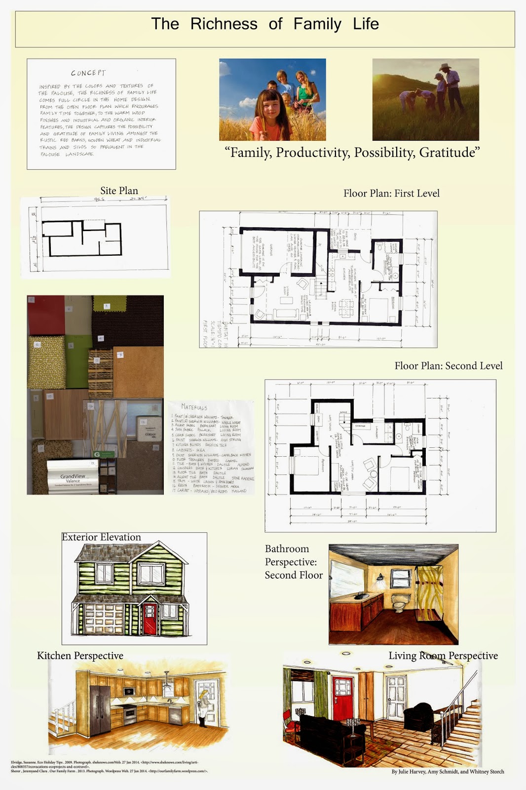
Monday, March 24, 2014

Portland Art Museum


I recently spent an afternoon at the Portland Art Museum. This was an absolutely wonderful way to spend an afternoon, I highly recommend taking some time to visit if you are able. I began by visiting the Ancient China Exhibit. This space had taupe colored walls, with white trim. The sculptures were enclosed in glass cases, and the lighting was spectacular, it really made the pieces come alive. The warm wood floors gave a nice haptic sense in the space. With the lighting you didn't even notice there were no windows in the room.


Ancient Chinese Horse Statue

 
The Portland Museum is very large, so after I did my wandering through the Chinese Art, I joined a group for a tour. The tour I took was  focused on experiencing the special exhibit in the museum entitled "Venice, The Golden Age of Art and Music". This tour was for the visually impaired, so since my current design project includes both a galley space and vision impairment elements, I felt this would benefit my understanding of visiting a museum with a visual impairment.
 
We began our tour in a room where a museum docent talked about the importance of music in the culture of Venice during the 16th Century. She then played a short tape, and talked about the common instruments of the time, after which a lute, recorder, and several violins were passed around for the visitors to try to play and to touch and feel. There was even a harpsichord for everyone to try!
 
After the introduction to the music of the period, we went upstairs to the gallery exhibits. We were seated in front of a large painting entitled "The Wedding Feast at Cana" by Veronese. The docent described the painting and the special features, colors and history of the painting.


After hearing about the artwork, the museum had organized a duet to play some of the period music for us. A violinist and recorder player were a wonderful addition to the time spent on this tour. I then went to experience the rest of the Venice exhibit on my own. What struck me most besides the art, was the colorful walls. Red, blue, green and gold were colors painted upon the permanent and moveable museum walls. The unifying factor was the white wainscoting and millwork. The wall colors really helped to "pull" you through the spaces. Here are a couple of examples of how they used color.


Lighting was all artificial in this exhibit, they used adjustable track lights, but not the type I usually see. These were recessed tracks in the coffered ceilings which the curators used to direct light onto the art pieces. There was also plenty of ambient lighting, which made the spaces bright and cheerful with all the color.


Wednesday, March 5, 2014

Vision Impairment

As a designer, it is always a good idea to understand your client. This is especially true if you have a client with special needs for their environment. I experienced being in a wheelchair to understand ADA requirements, and it was very beneficial to my understanding of the needs they have that are different from what I experience.  This exercise was to experience what a person with a visual impairment experiences in their interactions with the built environment. I think this is something everyone should try, it really forces you to understand some of the difficulties  of visual impairment.


The excercise was to wear sunglasses smeared with Vaseline inside the lenses. We then were to navigate both interior and exterior stairs, use an elevator, and try to use an ATM.  I learned that contrast in an interior space is crucial to navigating for someone with a visual impairment, especially from the wall to the floor. I would look to this line to guide me throughout the spaces I was in. Spaces without this contrast were much more difficult. At one point I could not tell there was a room, because the room had glass walls and the carpet and walls were all the same tone. Another problem was glare. Shiny floors with fluorescent lighting made things worse. If I could rely on contrast I was ok, but no contrast and glare to contend with, made navigation very difficult. A third problem was depth perception. This was especially true when trying to navigate stairs. At one point I was trying to go down some terrazzo stairs, and finally had to hold onto the rail, and someone's arm to get down. These stairs had the traditional black grip strips on them, but there was not enough contrast with the color of the stairs to differentiate the contrast.

All in all, it was a good learning experience, one that I will remember when I am designing spaces for the visually impaired.

Monday, March 3, 2014

Habitat for Humanity Project


This is a poster of a Habitat for Humanity house that I designed with two colleagues. It was a group project, and I learned quite a bit about working with others, and myself. I enjoyed working with the group, and we got along fine. I learned about designing a house for a Habitat family, and the aspects in a home they are looking for. This includes a small foundation footprint , a one car garage, and minimal hallway/extra space. The space is focused on the useable family area, as this is most important in a habitat home. Another thing I learned was to try to design in 2' to 4" increments for the best use of materials. While there are things I would like to improve on, mainly in the poster itself, I am proud of our layout, and the renderings we did for this project.

Concrete Concept


This Design project begins with the adaptive reuse of the Northern Pacific Railway station in Pullman. As my concept inspiration I chose this crack in the concrete foundation of the station. Elements of design that I derived from this include line, from the crack itself, texture from the concrete and the lichens growing on it, and contrast which includes rough and smooth and the differences in the color of the concrete.
 
 
The next part of the design process was to take the elements and principles that I found in my concept inspiration and create a 2-dimensional drawing . After exploring many options, I decided to move forward with this design. Now you may think this appears to be a flower, but to me it is a path. It is somewhat random, as the crack, but also somewhat predictable, like a topographical map of a steep slope. The lines represent the obstacles along the way, much like the path of life, or even a path of a railroad track.


From This drawing I progressed to my textile design. I took the line drawing and repeated it in a "path" varying the size and color of the design. The colors are derived from the color of the lichen in the concept inspiration, and the color of the sky, which I always think of when I think of hiking along a path.
 
Finally, I took my 2-Dimensional design and created a 3-Dimensional model using the same elements and principles of design from the other parts of this project. This concept process of the design was so difficult for me in the beginning, but now it has to be one of my favorite parts. I feel more at ease with the entire process, and I know how the progression is supposed to evolve.Here is a photo of my 3-D model.


In this model I tried to incorporate the texture, both smooth and rough, line, contrast, and a feeling of a path. I also wanted to show a contrast between the organic aspects from my inspiration, and the structural aspects of the concrete. I enjoy this process very much, and feel more comfortable with it each time I do the conceptual part of a design.