Friday, July 26, 2013

Seat and Shelter


After researching Baroque architecture, and creating abstract forms, it was time to create something new from these abstractions. I did a seat and shelter structure.Above are the drafted drawings of my structure, and the materials I envisioned using. I incorporated the visual texture in the stained concrete, and textured canvas of the awning.Here is the model I made to a 1'0"=1" scale.


Finally, I also drafted a plan view, and did a rendered sketch of my model.The photos on this poster are taken at 9am, noon, and 4pm to show the progression of the sun on the shelter. If I were to build this, I would shift the orientation, so that the shade would be over the seat.

The Spiritual Curve

 The Spiritual Curve is a metaphor I came up with to represent the curved line found in Baroque architecture and the religious nature of the time period. The title also has meaning to me personally, as I have been on a new journey myself.
 The inspiration came from the architect Jules Mansart, who designed for King Louis XIV. Mansart designed the Hall of Mirrors at the Palace of Versaille, and other Baroque structures. I then found a natural inspiration that in some way represented this time period. I chose a Florida coneshell. I felt this represented the curved line, visual texture, radial balance and rhythm through repetition that I was seeing In My Barouque Time Period.
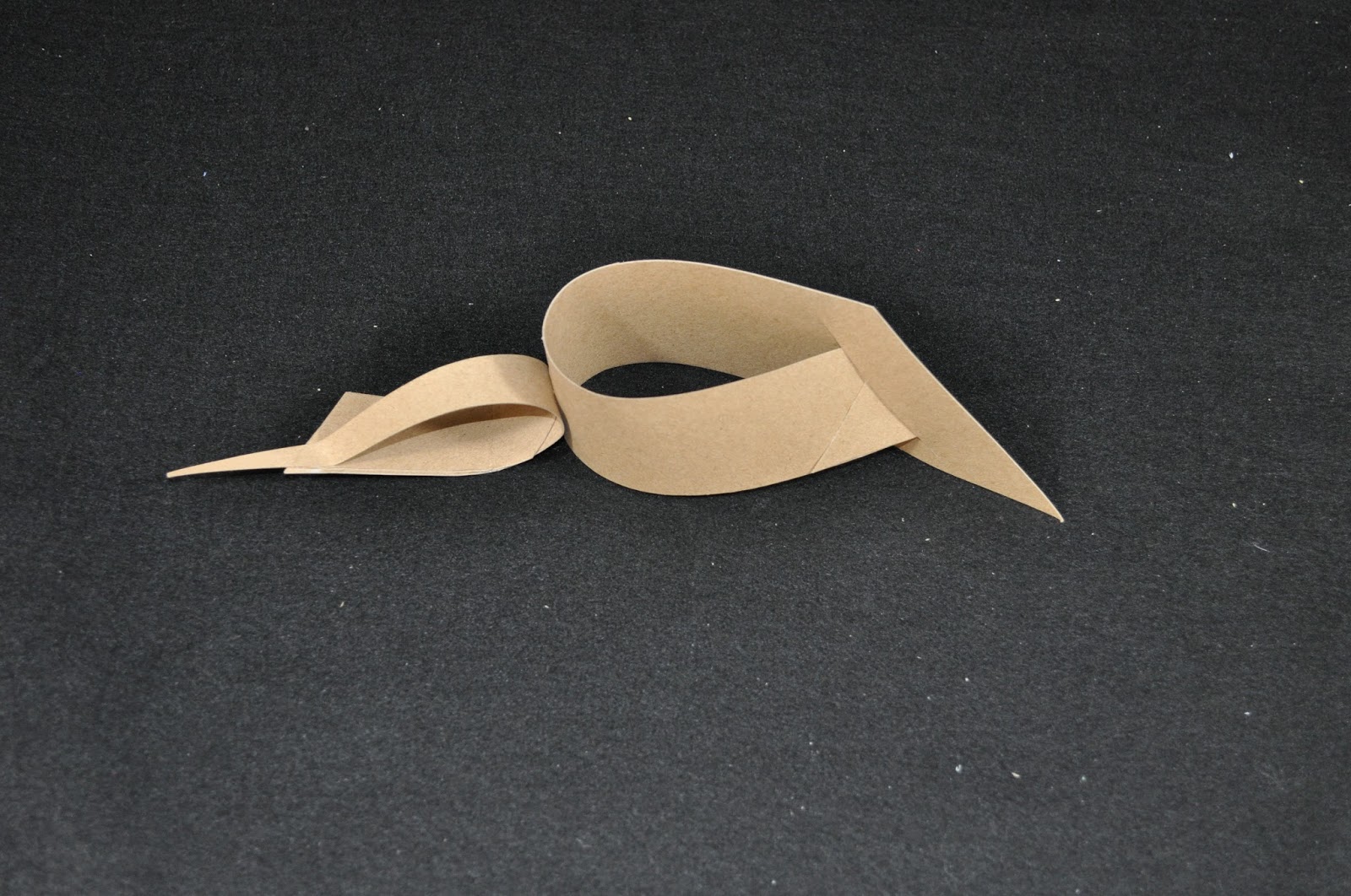
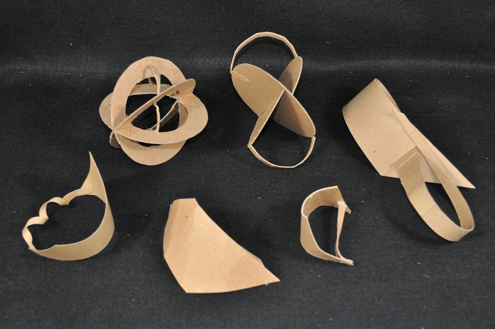
 I then did realistic drawings of the shell, and small thumbnail sketches of it's parts and elements. From there I abstracted the elements and principles of design and sketched thumbnails of my abstractions.After the 2 dimensional drawings were complete, I then took these to 3 dimensions, by making small informal study models.
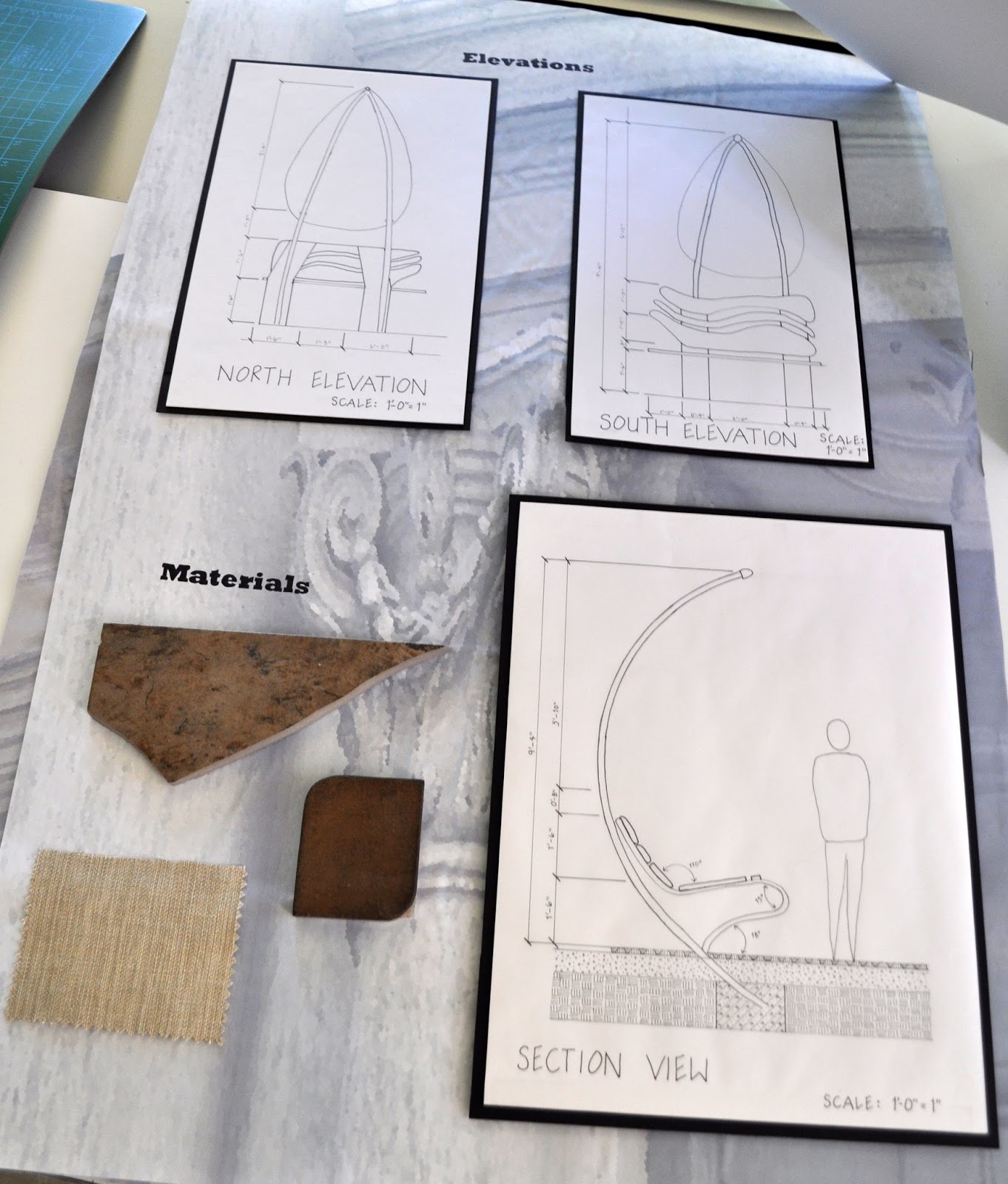
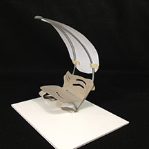
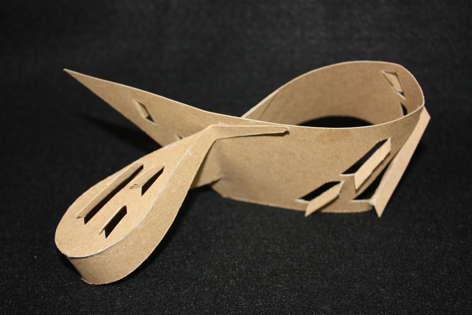
 Finally, through the process of hard work and editing, I came up with  a final abstract model.See it here

Morrill Hall

A 2 point exterior sketch I did of Morrill Hall. Again, this is on the campus of WSU. I would like to improve my skills in this type of sketch, as this one is a little bit skewed. I am improving my skills in sketching trees and bushes, so I know I will improve in these perspective sketches too. The thing I do like about this sketch is the use of value achieved in the graphite.

2 Point Perspective

This is my first 2 point perspective. I did a corner in my little apartment. While I like the range of value I achieved in this sketch, I wish I would have used a little more white. These windows are one of the reasons I rented this space, I just adore all the light they bring into my tiny place!

College Hall Sketch

This is College Hall on the campus of WSU. I love the buildings on this campus, many of them are this old style of architecture, and have such great detail.It makes for a challenging perspective sketch, but it is a fun challenge for me. I see in this work that I would like to improve upon my sketching of plant materials, and the perspective is a little off. I guess i need to pay more attention to these things while I am sketching.

A Favorite Way to Sketch

Take a nice warm summer evening, or afternoon, add a glass of wine, a good friend, and a sketch, and you have my recipe for a very enjoyable time! For this sketch, I did one study in graphite, and another in ink using a hatching technique for the shading. Combining the elements of shading and perspective drawing proved to be easier than i thought it might be, maybe it was the wine!

Stairs- Shade and Shadow

Studying the shade and and shadow that the stair railing makes on the concrete is a nice way to spend a summer afternoon in my book. I enjoyed this sketch, and learned how to look at shade and shadows that structures cast in a whole new way.

Leaves


I like this little sketch of negative space around a group of leaves. I darkened the edges of the forms around the leaves so the spaces would not seem so flat. I also shaded the area in a flowing pattern to give the background some movement. I feel it is important to see the shapes that the negative space makes, it can be so interesting.

Final Concept Model

Here is the final concept model I constructed in 3-Dimensions. The elements and principles of design I tried to pull out of my previous work were, curved line, rhythm through repetition. and visual texture. I feel I accomplished my goal, and this piece is now truly 3-dimensional. My previous models were merely enlarged lines, but not really meant to be seen from all sides. It has been a struggle to get to this point conceptually, as I have not done very much work in the abstract. While I have enjoyed the process, I hope to grow and get more adept and quicker in this process

Fruit Watercolor

For this sketch, I started with a little value sketch of a fruit grouping. Luckily I love fruit, and had plenty to choose from on hand! After my initial sketch, I took a piece of watercolor paper, and did the same grouping in watercolor. The background seemed very flat and white, so I added a little color wash to liven up the composition. I like how this piece turned out, a little bit controlled, and a little bit free flowing. I enjoy doing these types of studies, and hope to do more in the future.

Update on Design in 3 Dimensions

Here is an update on designing in 3 Dimensions.I took one of my favorite models an spliced it apart, then reconfigured it and glued it back together.I like the way this model is interesting from all angles, but it now lacks the fluid form and curved line that I am looking for.

Napkin Sketch

Here is a small sketch I did on a napkin. No measurements were used, just tried to "eyeball" it.  I also had trouble with the perspective and horizon line. But I like to do small quick sketches that are informal, as this one is.


Chair Study

For this sketch I drew and dimensioned a chair in my place.  While it is not perfect ( the seat should be flat on the side and back view), I am happy with the dimensioning. I feel it is a good representation of the chair, and fairly accurately shows the size and scale.

Wednesday, July 10, 2013

Design in 3 Dimensions

To take the abstractions I had sketched from 2 dimensions to 3 dimensions, I made forms out of chipboard. This material worked well, because it allows the form to be seen without any added color or differing surface areas. I only wish I had not chosen such a heavy chipboard. My fingers and hands paid the price for the thickness of this material. This process was inspiring,and I felt that the further I worked, the more ideas I had. I still see ways that I can take my designs further by tweaking the forms and adding and subtracting elements.

Concept Design in 2 Dimensions

As concept design began, I  found an object that in some way that had elements of design from the Baroque Period of Design. I chose a shell because of the curved lines and the domed shape of the cap.Then I proceeded to realistic drawings of my "found" object, which I did in graphite. I enjoyed doing these sketches, and felt that they were good representations of the shell that I began with. I always feel comfortable using graphite and thought that the shading and detail of the sketches was good.
The next step in my design process was to do thumbnail sketches to abstract the realistic images. I was purely looking at the elements and principles of design. Things that came to my mind, were radial symmetry, texture,curved line,rhythm and form, among others. While I enjoyed the abstractions, and have learned so much from doing them,  now I look back, and see other directions that I might have explored.

Tuesday, July 9, 2013

Tessellation


As I reflect upon my tessellation project, I have some remorse. While I learned so much doing this, I am not happy with the final product. I began with photos from the Baroque Period, then morphed them in Photoshop. I had several photos that never made it to my final product so I could have an analogous color scheme.  I had a clear vision of where I wanted this project to end at, but I was not able to make my vision happen. Hopefully with more technical skill I will be able to get closer to what I envision in the future.

Monday, July 1, 2013

Palouse Sketch


This is my first effort with the Wacom tablet, a computerized drawing tool. While I am definitely not proficient with this tool, I enjoyed using it and I am pleased with my result. I am hoping as time goes on, and I have more practice, I will feel more comfortable with this form of media. I like the line created, but did not realize that the line was not complete on the right horizon, and would  like that line to come to the edge of the picture. I am proud of  the painterly effect I created in this work,a skill I would like to build upon.